.png)
Hero by Vivun · Brand Rationale
Hero was built for
the moment a seller needs to perform
moments that matter.
everything else disappears.
Two marks.
One design system.
Hero's visual identity is built on two assets that work in tandem — a wordmark for full-context settings and an icon mark for tight spaces, motion, and product. Together they cover every surface the brand appears on.
Wordmark · On Light
Primary use — proposals, decks, partner pages, co-branded materials.
Wordmark · On Dark
Dark backgrounds — event walls, swag, product UI headers.
Wordmark · On Teal
Teal brand moments — campaign headers, hero banners.
Icon Mark · On Light
App icons, favicons, badges, and anywhere space is at a premium.
Icon Mark · On Dark
Dark-mode product UI, motion sequences, branded merchandise.
Icon Mark · On Teal
Teal backgrounds — event signage, motion, merchandise.
Wordmark anatomy
The name does two things at once.
"Hero" carries the product identity — aspirational, human, direct. "by Vivun" provides institutional context for buyers and enterprise stakeholders who need to know who's behind it. The two are set at different weights so neither competes with the other.
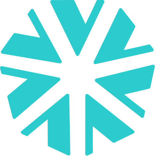
Icon mark anatomy
The pinwheel with a hidden thread.
The form is a pinwheel — open, kinetic, forward-moving. Look closer and the geometry carries a subtle "V" — a deliberate nod to Vivun without announcing it. The mark is fully legible without that knowledge. The connection rewards attention; it doesn't demand it.
Use
- Wordmark on any co-branded or external-facing document
- Icon mark alone when space is smaller than 40px wide
- White version of either mark on navy or teal backgrounds
- Maintain clear space equal to the height of the "H" on all sides
Avoid
- Stretching, rotating, or applying drop shadows to either mark
- Placing the logo on busy photography without a clear background zone
- Recreating or redrawing either mark from memory
- Using the Vivun logo in place of the Hero wordmark in any Hero context